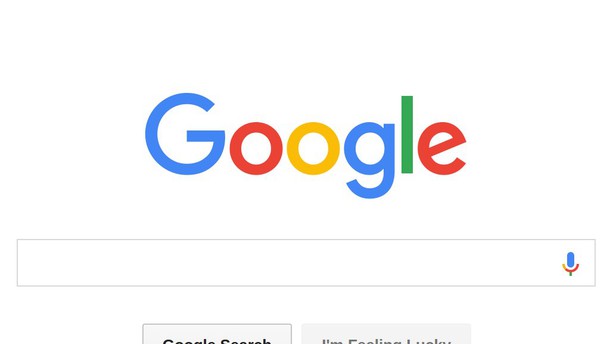
A lot has changed in the past 17 years, when you take a closer look at development stages of Google, world's largest web browser. They tackled various fields of interest, they made sure to often change and upgrade their services and products. It was now time for another change. There is something new about the nothing short of legendary logo, displayed on browser's startup webpage.
Google's official blog states that they've "taken the Google logo and branding, which were originally built for a single desktop browser page, and updated them for a world of seamless computing across an endless number of devices and different kinds of inputs."
Basically, Google's sharp-eyed designer took care of proper kerning, moving the letters into their proper place – the bottom of the "l" and "e" was slightly off, so the designer moved the "g" no more than one pixel to the right, while the "l" was moved one pixel down and then to the right. And there you go. All letters are now perfectly aligned. Google also replaced the little blue "g" icon with a four-color "G" that matches the new logo.
The announcement on Google's blog concludes with: "This isn't the first time we've changed our look and it probably won't be the last, but we think today's update is a great reflection of all the ways Google works for you across Search, Maps, Gmail, Chrome and many others."
Now let's be honest: did you really notice the change, before you were told about it?


